Lenovo Smart Clock 2
Lenovo's A$129 Smart Clock 2 is more of a slight reimagining of the original Smart Clock than a proper sequel. We like the addition of a wireless charging base with a built-in night-light. And aside from the dock, this is pretty much the same Google Assistant smart display as the previous model, with mediocre touch-screen functionality and underwhelming sound quality. Depending on your voice assistant of choice, you'll be better served by the A$149 Google Nest Hub or the $119 Amazon Echo Show 5.
Pretty Much the Same
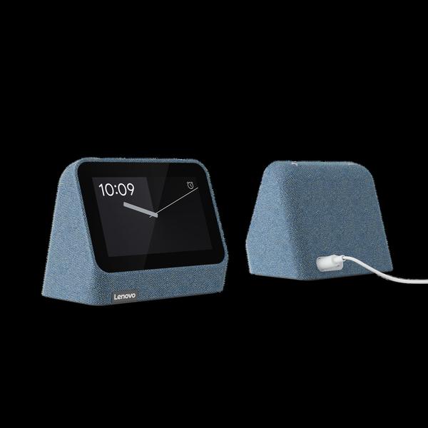
The Smart Clock 2 closely resembles the original. Both feature fabric-covered bodies (blue or gray this time around) with triangular profiles that tilt the touch screen up slightly and form top edges rather than flat panels. It's a bit less triangular than the previous model; its back surface curves slightly from the top and an 0.8-inch fabric-covered chin lifts the screen.
Like the original, the top of the Smart Clock 2 features rubber volume buttons, but that’s it for any non-touch-screen controls. The back of the device has a connector for the included power adapter and a mic mute switch. However, it lacks the USB-A port that the previous model had, so you can’t charge other devices with it. Instead, you can dock the Smart Clock 2 with the optional base to get a USB-A port, a wireless charging pad, and a night-light.
The base is rectangular and measures 8.5 by 3.3 inches (HW); it's only available in white. The clock slots into a recess on the left slide of the base, which is bordered by a white night-light. Contacts on the bottom of the clock connect to the base and power it through the clock’s power adapter. A plus sign to the right of the recess marks the wireless charging area, while the USB-A port sits on the base's back edge.

Aside from the redesigned profile, the lack of a USB-A port, and the option to attach it to a charging base, the Smart Clock 2 seems nearly identical to the first Smart Clock. It has the same four-inch, 800-by-480-pixel screen and 1.5-inch, 3-watt front-firing speaker driver. These are all very modest specs, especially compared with the Echo Show 5's 5-inch 960-by-480 screen and 1.7-inch driver. The Echo Show 5 also has a camera for video calls, which the Smart Clock 2 lacks. That said, you can still make phone calls and voice calls with the Smart Clock 2 via Google Duo.
Not Many Screen Features
While it’s technically a smart display, the Smart Clock 2 acts more like a smart speaker because of the limitations of its screen. It can show the time, act as a digital photo frame for your Google Photos, and show weather reports and upcoming appointments on your calendar (G Suite support is still frustratingly, and confusingly, unavailable on Google-powered smart displays).
However, the Smart Clock 2 can’t show video, even if you stream it directly from a mobile device; it shows up as a Google Cast audio option, but not a video device like the Nest Hub. The Smart Clock 2 also doesn’t have a web browser. When I tried playing music directly from its touch screen, I could only select one of three seemingly random songs from my smart playlist on YouTube Music.
Fine for Voices, Bad for Music
Ultimately, the audio here is clearly balanced for conversations rather than music. While music gets very little sense of power, both Google Assistant and podcasts sound clean and easily fill a small room.
When playing our bass test track, The Knife’s “Silent Shout,” the Smart Clock 2 distorted on the bass synth notes and kick drum hits at high volumes. The acoustic guitar plucks in the opening of Yes’ “Roundabout” get good string texture in the higher frequencies, but very little resonance in the lows and low-mids. When the track properly kicks in, the guitar, hi-hat, and vocals cut through the mix with very prominent highs. The bass lingers in the background and offers no sense of depth to balance out the mix, however. It’s a very bright sound.
The Crystal Method’s “Born Too Slow," a track with some pretty screechy synths and vocals, also sounds very highs-focused. The backbeat comes through with little thump, setting the pace of the track without giving the ominous bass punch needed to anchor it down. Once again, the Smart Clock 2 sounds bright almost to the point of being harsh.
Still an Underwhelming Smart Display
The Lenovo Smart Clock 2 doesn’t offer many improvements over its predecessor and remains very limited as a smart display. Our biggest complaint is that Lenovo moved the USB port for wired charging to an optional base that costs an extra $20. The base does have a night-light and supports wireless charging, but we would have preferred if the USB port was still built into the actual clock.
If you're dedicated to Google’s ecosystem, the second-generation Nest Hub is an Editors' Choice award winner for smart displays; it's significantly more powerful, with a larger (and more capable) touch screen and better speakers, as well as the ability to track your sleep. At $99.99, the Nest Hub is bigger and more expensive than the Smart Clock 2, though. For a bedside clock that supports Google Assistant, the Lenovo Smart Clock Essential ($49.99) is a compelling alternative. It has a simple clock-radio-style display that shows the time and temperature, plus an integrated night-light. It won’t wow you with its sound quality, but it costs $20 less than the Smart Clock 2. If you’re not committed to Google, meanwhile, the Amazon Echo Show 5 is a small, but excellent, Alexa-powered smart display, with better audio quality than the Smart Clock 2, a much more functional touch screen, and a camera for making video calls.


