Amazon Echo Show 15 review: Alexa’s on your wall AGREE TO CONTINUE: AMAZON ECHO SHOW 15
The original idea for Amazon’s Echo Show was a large, screen-based device that would offer up relevant, glanceable information for the modern family, replacing outdated devices like bulletin boards, paper calendars, and sticky notes on the fridge. In 2017, Amazon couldn’t quite achieve that vision for a price that a modern family would be willing to pay. So, instead, it released a small, squat seven-inch touchscreen smart speaker that, frankly, did little more than Amazon’s screen-less Echos.
But it was a start. And as the Echo Show has evolved over the ensuing four years, the company finally has a device that it thinks fits that original vision: the Echo Show 15.
The $249.99 Echo Show 15 is billed as a shared hub for families to see things like upcoming calendar appointments, to-dos, digital sticky note reminders, and shopping lists. It’s also an excellent kitchen TV (not a high bar, to be fair). Of course, it does everything other Echo displays and speakers do, thanks to the presence of Amazon’s smart voice assistant, Alexa. This includes playing music, showing weather reports, streaming video, controlling smart home gadgets, telling fart jokes, all the stuff you’ve come to rely on Alexa for.
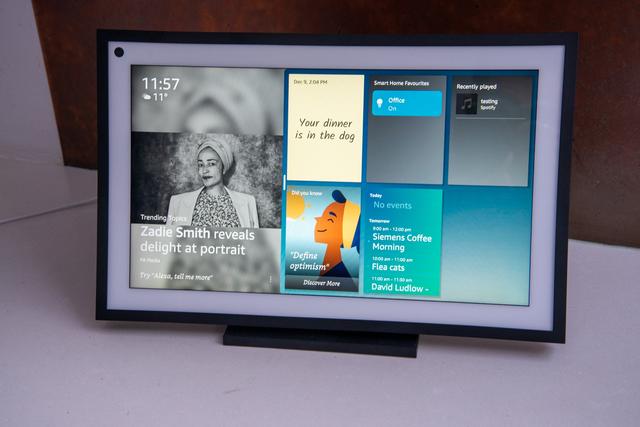
A very solid piece of hardware, the Echo Show 15 is a stunning device. It looks impressive on your wall when called into action, and otherwise blends into the background as a digital photo frame displaying art or family photos. It fills a niche that no device has reliably conquered to date: a wall-mounted tablet to replace the plethora of analog paper tools busy households traditionally rely on to communicate with each other. You can use it on your countertop with an optional stand if you can find the room — at 15.8 x 9.9 x 1.4 inches, this thing is huge — but the wall is the better option.
The concept is good. But the execution is underwhelming. As is a theme with Amazon devices, on day one there is plenty of room for improvement on the software front. There’s a lot crammed onto this admittedly large screen, but ultimately while the Echo Show 15 tries to be something for everyone, it ends up struggling to be particularly useful for anyone.
In terms of specs, the Echo Show 15 is a 15.6-inch screen with a 1080p touch display, with the processing power of the new Amazon AZ2 neural edge processor behind it — the first Show to use Amazon’s latest chip. It has a new homescreen layout that divides its time between the standard rotating Echo Show content (which you can customize) and a new feature: widgets. You can also have it just display art or photos (stored in Amazon Photos or Facebook, nowhere else, sadly), fulfilling its picture frame ambitions.
Aesthetically, the Echo Show has a black frame with a white mat, resembling a standard picture frame. Tech-wise it looks like the Samsung Frame TV and the Facebook Portal had a baby. It comes in one color, and you can’t change the familiar Alexa blue background behind the widgets — I’d like to see some customization options all around. Two 1.6 speakers on either side (or top and bottom in portrait) provide decent if slightly tinny sound, and a small row of buttons on the top or side (depending on orientation) offer volume up / down, mute, and camera shutter controls.
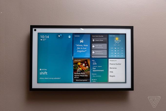
The widget concept is a nice addition, and the potential is huge — especially as Amazon has released an API that developers can use to add widgets to their Alexa Skills. Currently, however, you’re stuck with a dozen or so Amazon widgets that are limited in their usefulness. They include calendar and reminders (you can import calendars from Google, Apple, and Microsoft), shopping list, sticky notes, smart home controls, a to-do list (Alexa only), weather, your commute, photos, maps, music and audio, reorder suggestions, Alexa suggestions, and your Amazon deliveries. A new What to Eat option offers up recipes and nearby delivery suggestions from partners such as Domino’s and Whole Foods.
In our app-driven world, you likely already have favorite tools that do most of these things, and frustratingly, you can’t port any of them to the Show. It’s all Amazon, for now. There’s also limited customization, and while you can rearrange and resize some widgets, if you have any enabled they take up almost half the screen. While the Show 15 is noticeably snappier than others in the family, it’s not super responsive and takes two or three seconds to respond to taps and swipes.
Interestingly, the widgets take the Show from being a voice-first device (which is something I’ve always struggled with) to one with a lot more touch functionality. It’s the most tactile Show to date, and the widgets invite you to come on in and stay awhile as you check your calendar, browse shows to watch on the expanded Video Home screen, and attempt to control your smart home from the (limited) Smart Home widget (more on this later).
While the Show 15 is designed as a hub for family organization, it is not a communication device. My biggest disappointment here is its 5-megapixel camera that produced pixelated, blown-out images during my Alexa calling and Drop-In testing. (Zoom is not yet supported, but Amazon says it will be coming next year.) Despite the souped-up processor, video constantly freezes and lags, making it unusable for an actual conversation. It also doesn’t have the auto-framing of its Echo Show 8 and Show 10 counterparts, both of which have a more robust 13-megapixel camera.
It seems Amazon was looking for a differentiator from the Show 10, which Amazon tells me is its “communication device.” The rotating 10 can follow you around a room while you talk, keeping you in the frame as you chop veggies or unload the dishwasher. But who really is going to have a Show 10 and a Show 15 in their kitchen? Two $250 devices in one room seems like legitimate overkill. If they had bumped up the camera in the 15 to make video calling better, this would be a much more useful device.
The best feature of the Show 15 is its size. To date, screens for the kitchen have either been too large (see GE Appliances’ monstrous screen built into an over-the-range hood) or too inflexible (Samsung’s Family Hub fridge with a portrait tablet built in). The Show 15, like Goldilocks’ proverbial porridge, is just the right size. The 15.6-inch screen’s housing is just shy of 10 inches tall and 16 inches wide and is designed to fit under standard kitchen cabinets or between two doorways in an open plan house, Chris Green, VP of industrial design at Amazon Lab126, tells me. It’s also very flexible. You can mount it on the wall in either a portrait or landscape orientation, and thanks to the included, cleverly designed mount, it’s easy to swap it from one to the other when your use case changes.
A compelling reason to buy this is for a good-quality, compact screen for watching TV while in the kitchen. It’s the first Echo Show to support full HD resolution streaming from Netflix, Prime Video, and Hulu, but it’s missing key players such as Disney Plus and HBO Max. Sling TV support is coming soon, which will bring another option for watching live TV (Hulu Live being the other).
One downside, however, is the 16:9 ratio of the screen means you get two black bars when watching widescreen movies. The white picture frame design also doesn’t lend itself to immersive viewing — but for a kitchen TV, it’s a nice device.
A new feature that makes this more useful is picture-in-picture. This allows you to view a security camera feed or video doorbell while also looking at other content. So, you can have a baby monitor running while you’re following a recipe. The Show can stream video from any Alexa-compatible camera and if you have a Ring video doorbell, it will pop up a live feed on the screen when someone rings the bell and you can talk to them through the device.

In my testing, I initially assumed I’d want it in the landscape orientation — and for TV viewing, that was the best option. But for the family hub features — shopping lists, calendars, and even widget use — it was more helpful in portrait as you see more information on the screen. This was especially true for smart home control. And while you can’t pin a full-screen widget (it always reverts to the home screen), the full-sized portrait smart home widget shows 12 separate tiles for your devices, compared to just six or seven in the landscape. Frustratingly, you only get individual devices to control in the widget (no groups) but in the full-screen mode, you do get the option to use groups.
Setting up the Show is an easy process; once powered on, you walk through a series of screens to connect to Wi-Fi and accept Amazon’s litany of terms and agreements. New here is the option to add Visual ID (Voice ID and enabling Amazon Sidewalk may also be new to you if you haven’t set up a Show in a while). These are all optional, but the Visual ID — a new feature that leverages that AZ2 processor — uses the camera to serve up relevant content such as calendar appointments, commute times, and notes from family members, depending on who is standing in front of it. It can even be used to gate content to kid-safe things if you set it up to recognize a child.
This is great in theory, but in my testing, it repeatedly failed to identify who was there and sometimes couldn’t see anyone at all. The Show can also recognize your voice, but that regularly failed in my testing, too. Amazon says the processing for the Visual ID happens locally, and the identifying information is stored on the Echo Show 15 itself, not in the cloud. The facial profiles aren’t shared across devices, so you need to set it up with each Echo Show 15. This feature is also coming to Show 8 and Show 10, according to Amazon’s press materials.
I ran into several issues setting up Visual ID and Voice ID for my family members, specifically my children. If you have Amazon Kids profiles set up already, you just tap on those in your account settings and walk through the process. I had no problems setting up my daughter’s Voice and Visual ID, but when it came to my 13-year-old son, the Show kept thinking he was my daughter. He was not amused. After the third time Alexa recognized him as a 10 year-old-girl, he was done with the whole thing.
Every smart device now requires you to agree to a series of terms and conditions before you can use it — contracts that no one actually reads. It’s impossible for us to read and analyze every single one of these agreements. But we’re going to start counting exactly how many times you have to hit “agree” to use devices when we review them since these are agreements most people don’t read and definitely can’t negotiate.
In order to use the Amazon Echo Show 15, you’ll need to download the Alexa app for iOS and Android. An Amazon account is required to sign in. By signing up for one of those, you must agree to its conditions of use.
After that, setup is on the device where “By proceeding, you agree to Amazon’s conditions of use and all of the terms found here.” You can explore the documentation at that link, but below, we’ve listed the 12 terms that you must agree to:
Additionally, you can choose to set up Voice ID and / or Visual ID and Amazon Sidewalk. If you set up Visual ID, you “authorize the creation, use, improvement, and storage of your visual ID.”
Final tally: 12 mandatory agreements, three optional
Visual ID was also buggy in everyday use — it seemed to like my daughter the best, often mistaking me and my husband for her. But occasionally, it just wouldn’t work at all, stubbornly refusing to see me as I stood in front of it. When it did work, the only real personalization features were recently played music. It can offer up different calendars based on who is viewing, but in the time I had to review the device, I wasn’t able to reconfigure all my family’s individual Apple and Google calendars to sync with Alexa. Instead, I ported in a shared Google calendar we use.
I’d advise setting up the device first and trying it out in a couple of locations before committing to a wall mount, although that was my preference after spending a week testing it. The wall mount option is nowhere near as daunting as I’d anticipated. Amazon provides a paper template, and you’ll want to break out a level and a drill, but it’s mostly painless and not much more work than hanging a large picture or artwork on the wall. Drill holes for four screws, attach the wall mount, and you’re done. The Show slides onto the mount thanks to four grooves in the back and you can switch between portrait and landscape at will without having to re-drill anything.
A tabletop stand sold separately for $30 doesn’t offer as much flexibility (you need a screwdriver to reconfigure the orientation). For $40 there’s an option that will let you change from portrait to landscape without having to break out a screwdriver. An under-cabinet mount for $50 lets you tilt and swivel. I tested the $30 stand, and it’s solid and well-made but very large. The footprint this thing takes up on a countertop (289 square inches in our test setting) is too big for a lot of kitchens.
The biggest issue with wall mounting is going to be cable management. If you’re okay with a cord going down your wall and you have a nearby outlet, you’re all set. But if you’re like me, you are going to want to route this through the wall or devise another way to hide the cable. Amazon’s Chris Green tells me that snaking the cable through the wall as you might with a TV is perfectly fine, but you know — at your own risk and endeavor.
The Show 15 comes with a five-foot cable, potentially making placement tricky (a six-foot extension cord is available for $13). I had nowhere in my kitchen to wall mount this, as all my walls are tiled, except for one corner of the room that would have made the perfect spot, but there’s no outlet anywhere nearby. I ended up placing it in portrait mode in a main hallway that we use to come in and out of the house. While we sacrifice the TV aspect this way, it’s actually a more useful place for some of those visual reminders, and I have the lights for the three closest rooms set up on the smart home widget.
Speaking of the smart home side, it’s a big disappointment. There’s no Zigbee radio built in for connecting devices and the three or four individual devices you can access from the smart home widget limit its usefulness for managing your connected home. You can’t pin the full-screen smart home control to the display; it will always revert to the homepage. You also can’t tap the widget to get to it, you have to swipe down and tap the Smart Home button from the menu. I couldn’t even get a voice command to bring it up. It was not designed with the smart home front of mind.
However, if that’s not your primary use case, this can be a handy tool for household organization. That is once some software updates roll out to fix those Visual ID bugs and a few non-Alexa widgets start appearing. As of today, it’s only helpful if you are all-in on Amazon for organization of your shopping, reminders, and to-do lists. If you’ve been wanting a wall-mounted smart display, this is really your only ready-to-use option and will be a great addition to your kitchen if you’re happy with the limited ecosystem. But if you like using other services, I’d advise waiting to see what widgets third-party developers come up with before picking one up.
Correction, 4:55PM ET, December 16th, 2021: An earlier version of this article stated that it wasn’t possible to use the Echo Show 15’s camera as a motion sensor for Alexa Routines. That is incorrect, you are able to trigger routines using the camera as a motion sensor. We regret the error.


